Public Institution - Graphic Design

Graphic Design and Signage
As part of the renovation of the workspaces of this public institution, envisioned and designed by LemayMichaud, the environmental graphic design mandate was approached in two parts: the branding of the spaces and the adaptation of signage.
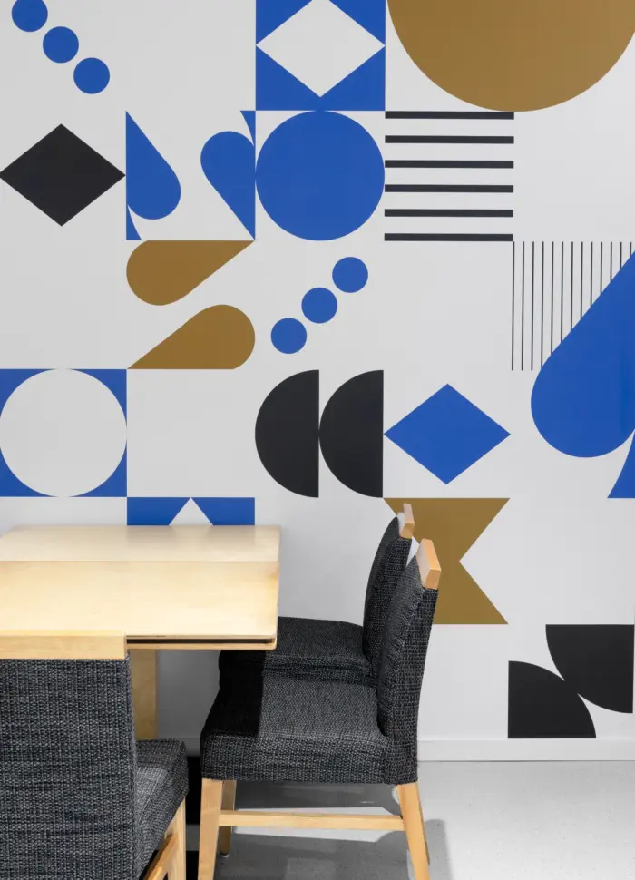
A Modular Landscape
The installation of printed acoustic panels on rails throughout the space allows for modular and adaptable environments. Aiming to evoke the institution's universe, the visual choices combine the organization's fields of expertise with the shapes of road signs. With a textured and soft visual treatment, the color choices align with the sector's dominant palette. They harmonize with the designed space, while establishing a reference point in relation to the rest of the workspaces. The visual treatment can be appreciated both as a whole and in fragments. The movement of the panels offers the possibility to contemplate a landscape that evolves according to the life in this workspace.


A series of custom pictograms was designed, primarily to harmonize with visual elements already used by the organization and to identify previously non-existent spaces.


Signage: when form adapts to function and space
As a public organization, the signage standards of the Quebec government are prioritized for seamless integration into the space and to quickly communicate the function of the areas. Thus, in addition to replacing blue with black, the color palette consists of two additional colors: yellow to identify collaborative zones and spaces, and blue to identify concentration zones and spaces.