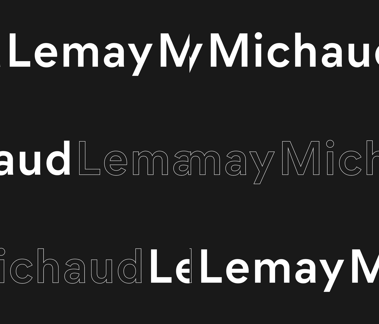
LemayMichaud Branding

revamp its brand image to reaffirm its leadership in the field of architecture and design
LemayMichaud's new brand image aims to reflect its evolution and reaffirm its position as a leader in the world of architecture and design. Created by the in-house graphic design team, the redesign offers a visual environment with impact, clarity, balance and timelessness through the legibility of the name and the addition of a meaningful symbol.


Inspired by the strength of a name
The logo is the result of a combination: the merging of the founders' names reflects unity, collaboration, complicity, and transdisciplinarity, all the while referring to the company's 43-year history and reputation. The symbol is a monogram that unites the L and the M, thus creating a play of form and counter-form thanks to the combination of three solid pillars. In turn, its abstract composition evokes the inseparable amalgam of architecture and design, disciplines that have been intimately linked since the founding of the firm.


It is through a demure, yet assertive application that the visual environment stands out. On contrasting shades of grey, it is through the colors of its creations that LemayMichaud reveals itself. An illustrative texture bridges the gap between the firm's identity and its portfolio, displaying concrete or abstract parts or silhouettes of architectural and design works.


Timeless and accurate in its expression, the brand image conveys LemayMichaud's values of humanism, integrity, rigor and innovation. Founded in 1979, the firm is an important player in the architectural and interior design scene in Quebec. Its notoriety is transmitted by its name, a long and difficult word to remember. Readability is enhanced by the interplay of capitals and lowercase, providing a visual break and recognition of the two words to the reader. The abstract symbol adds impact, catching attention while evoking the company's fields of expertise.


